Here’s Why the New PAGCOR Logo Went Viral

The newly-launched PAGCOR logo drew flak for its design and steep PHP 3 million pricetag. We delve into what happened and why it went viral among netizens.
Filipinos are known for their creativity, among many other achievements and feats. In fact, statistics say that there are around 6.98 million Filipinos who are employed in the creative industries. What’s more, Filipinos are also known for their keen eye for detail. This is why it was no longer surprising to see how Filipinos reacted to newly unveiled logos—especially the recent one that the Philippine Amusement and Gaming Corporation (PAGCOR) recently unveiled: a new red and blue logo that resembles a flame.
People took their sentiments to social media to express their disappointment about how this logo worked as a downgrade from the one it replaced. Aside from how it looked, what irked them more was when they found out how the logo cost PHP 3 million pesos.
Along with the backlash came some allegations that the new logo was plagiarized—which PAGCOR and the artist refuted. Here are more details about it.
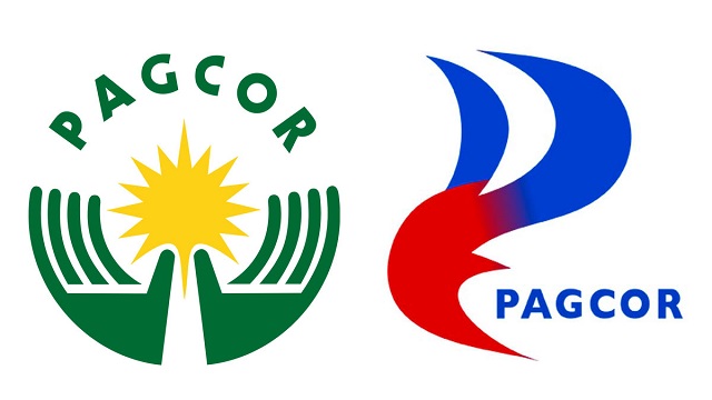
About the New PAGCOR Logo
“The new PAGCOR logo incorporates the element of fire associated with energy, inspiration, passion, and transformation. It symbolizes the flame that ignites change and drives progress. The logo also reflects a beacon, which stands for guidance, leadership, and direction. It represents a guiding light that helps people find their way,” says PAGCOR Chairman and CEO Alejandro Tengco.
The logo—created by multi-award-winning artist Francisco D. Doplon of PrintPlus Graphic Services— was officially launched on July 11 at the Marriott Hotel Manila. From that moment on, the said logo faced extreme backlash, especially after it was revealed that the agency accepted the PHP 3,035,714.28 quotation for that project alone. This sparked several discussions on how the budget can be used for better projects that will benefit the Filipino people since it was paid for by the taxpayers.
Despite the negative reactions being thrown at it, PAGCOR defends the said logo, saying that it was created to symbolize the company’s “long-standing commitment of being a guiding force that illuminates the way forward, drives transformation and development, and brings inspiration and motivation to the lives it touches.”
Debunking Plagiarism Claims
Aside from comments that compared the new PAGCOR logo to Petron and Lucky Me Noodles, Netizens also pointed out how the logo looks like it was copied from Tripper.
In a screenshot taken of tripper.academesoft.shop—now an unavailable link—it had a logo that was similar to the new PAGCOR logo, except it was light blue in color. This led people to the conclusion that the PAGCOR one might have just ripped it off.
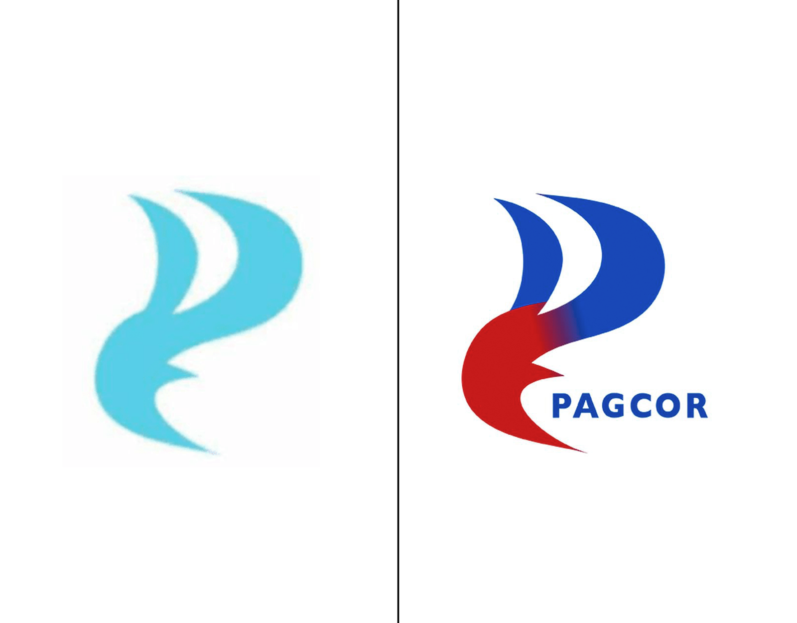
In a statement, PAGCOR defended its logo by saying, “The allegation made against PAGCOR is entirely false and driven by malicious intent. Throughout its operations, PAGCOR has consistently upheld the highest standards of integrity, transparency, and accountability. The agency remains dedicated to fostering a safe and thriving gaming industry in the country.”
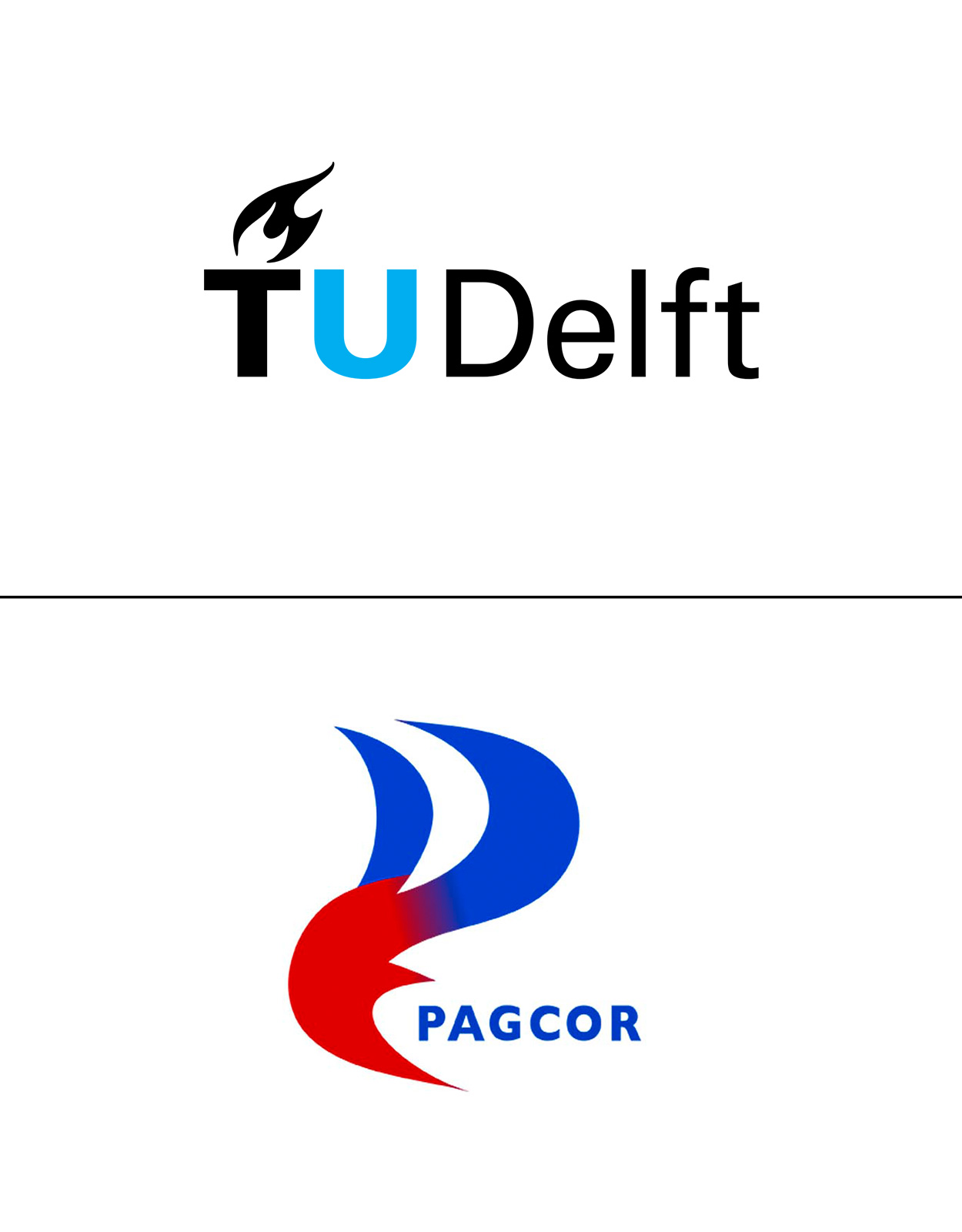
Aside from being compared to Tripper, the new logo has also been compared to the logo of Delft University of Technology in the Netherlands. However, some netizens, including former journalist Allan Afdal Nawal pointed out that it was different, as the university’s logo has a stylized flame on top of the letter “T” in “TU Delft”.
How Netizens Reacted
Netizens chimed in to show their dismay over the new logo, saying comments like “it didn’t look good,” “the colors weren’t mixed well,” “it looks cheap,” “a grade 1 student can do better than that,” and many more. Still, the bottom line on where the bad comments all boil down to is how the taxpayers’ money could have been used more wisely.
That being said, the new logo went viral on social media—with some artists even coming up with new logos that they said would be a better fit for the government agency.
Many people on Facebook say things like “If it ain’t broke don’t fix it,” while referencing how the government had unnecessarily changed the logo not just for PAGCOR. Rather, it also applies to the new slogan of the Department of Tourism which was changed from “It’s More Fun in the Philippines” to “Love the Philippines.” Some also point to the new logo of the Bangko Sentral ng Pilipinas (BSP) and the logo used for the 2019 Southeast Asian Games.
Legal Actions About the New Logo
In response to the new logo, members of the Makabayan bloc filed a resolution at the House of Representatives that serves as an inquiry into the “questionable” contract that PAGCOR obtained. Filed by ACT Teachers Rep. France Castro, Gabriela Rep. Arlene Brosas, and Kabataan Rep. Raoul Manuel, the resolution takes note of Printplus Graphic Services’ registration.
In line with this probe, Sen. Risa Hontiveros says, “The questions popping up in the minds of the public are very reasonable: who proposed this new logo design? Isn’t matters like this supposed to be in-house jobs? If it is outsourced, who is that agency?”
“Why is PAGCOR concerned with a change in [the] logo when it could have been attending to other more urgent problems that needed urgent solutions—at least from the perspective of the Senate committee on women—such as how PAGCOR-licensed POGO companies have been involved in human trafficking and cyber-scamming,” Hontiveros adds.
With the wide uproar caused by this new logo launch, many people wonder about why it was necessary and what prompted the changes. Though the logo change sparked curiosity, what fueled the fire and drives the anger of the masses is why it was overpriced, with netizens saying there are several Filipino designers who can take up the same job without charging that much.
